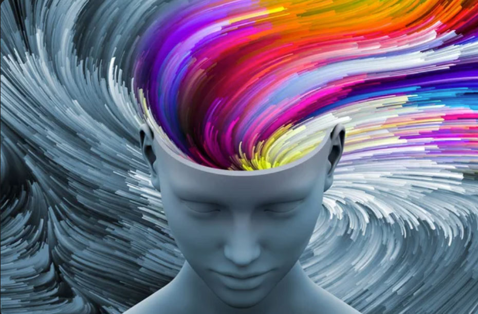
Color Psychology
Color Psychology is the analysis of how color influences moods, feelings, and attitudes. It explores the meaning and symbolism behind different colors, and how they can be used in marketing, advertising, and product packaging. By understanding color psychology, we can use color to evoke specific emotions, set a particular tone, and create a unique brand identity.
The psychology behind warm and cool colors is rooted in the way our brains process color information. Understanding this helps us choose the right colors to elicit the desired emotional response from the target audience.
THE PSYCHOLOGY OF WARM AND COOL COLORS
Warm colors, such as red, orange, and yellow, are associated with energy, excitement, and warmth. They tend to stimulate emotions and grab attention, which makes them effective for marketing and advertising purposes.
Cool colors, such as blue, green, and purple, are associated with calmness, relaxation, and stability. They tend to have a soothing effect and promote feelings of tranquility and peace. Cool colors are often used in healthcare and wellness products to create a sense of calm and promote relaxation.
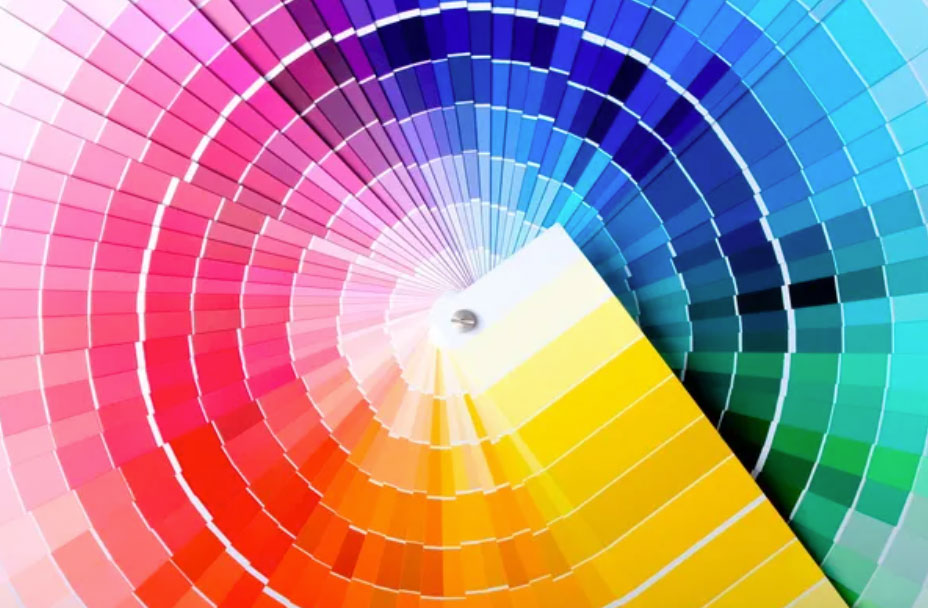
WHAT DO CERTAIN COLORS MEAN?
Colors can have various meanings and symbolism. It’s important to keep in mind that the interpretation of color can also vary depending on cultural, personal, and contextual factors.
- Red: Passion, love, anger, energy, excitement, urgency, danger, and courage.
- Orange: Warmth, friendliness, creativity, enthusiasm, adventure, and fun.
- Yellow: Happiness, optimism, joy, intellect, caution, and clarity.
- Green: Nature, growth, health, harmony, renewal, and freshness.
- Blue: Calmness, trust, loyalty, wisdom, stability, and serenity.
- Purple: Royalty, luxury, ambition, creativity, and spirituality.
- Pink: Love, romance, gentleness, compassion, and sensitivity.
- Black: Power, sophistication, elegance, mystery, and authority.
- White: Purity, innocence, simplicity, cleanliness, and clarity.
- Grey: Neutrality, balance, sophistication, and practicality.
It goes without saying, color should always be used in a way that supports the overall brand positioning and message.
This is why it is important to do the strategy work BEFORE you begin your package design, so you can make sure you consider all your brand’s touch points from the beginning.
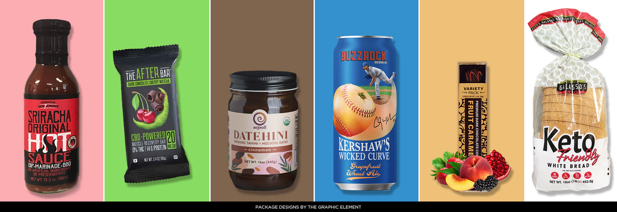
COLOR AS IT RELATES TO FOOD PACKAGING
RED is an appetizing color that can stimulate hunger and create a sense of excitement. It is often used for spicy and bold-flavored foods.
GREEN is associated with freshness, health, and nature, making it a popular choice for organic and healthy foods.
BROWN is often used for natural and rustic foods, such as grains and nuts, as it creates a sense of warmth and earthiness.
BLUE is a calming and refreshing color that can be used for products that are intended to be relaxing or cooling, such as ice cream, water, and other beverages.
YELLOW is an attention-grabbing color that can create a sense of warmth and happiness. It is often used for sweet and indulgent foods, such as cookies and candies.WHITE can create a sense of simplicity, and purity, making it a popular choice for dairy, nut milks andclean ingredient products.
We hope you are enjoying this series on brand strategy and visual branding.
Up next – WHY FONTS MATTER – and how they affect how your brand is perceived.