Why the font you choose for your brand matters
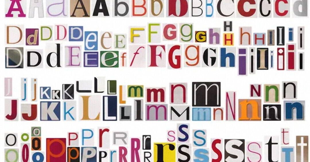
Font choice is an important aspect of branding and design as it can affect how the text is perceived and received by your audience. Overall, fonts can communicate a wide range of characteristics about your brand, from tone and personality to industry and audience, so it’s important to choose fonts wisely to make sure you are communicating exactly what you intend to.
First things to consider when choosing your brand fonts:
- Legibility: The primary function of text is to be read and understood, and the right font can make this process easier. Fonts that are too complex, too small, or too decorative can be difficult to read, and can turn off the audience.
- Brand identity: A font that aligns with the brand’s personality and values can help to create a consistent and coherent message across different marketing and advertising materials.
- Tone & style: A bold and sharp font can be perceived as strong and impactful, while a flowing and elegant font can be perceived as sophisticated and refined. The right font can enhance the tone and style of the message and support the intended mood or feeling.
- Context: The context in which the text is presented can affect how the audience perceives the font. For example, a font that works well for a casual and friendly brand may not be appropriate for a more professional and serious brand.
By carefully selecting fonts that align with your positioning, you can use specific fonts to help establish a strong and consistent visual identity.
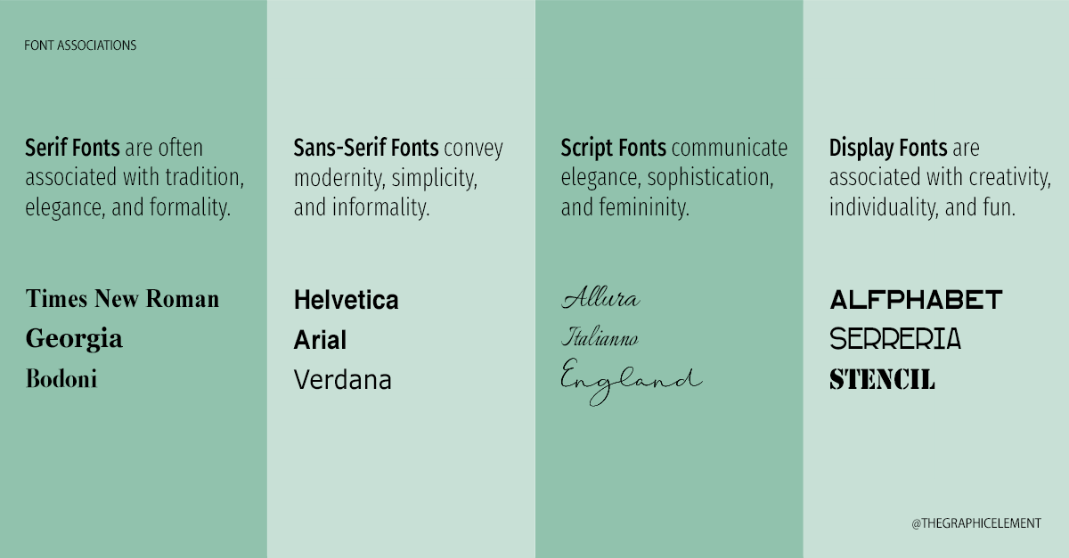
When choosing a font, it’s important to understand the message and tone you want to communicate. The graphic below highlights different font styles and the associations conveyed with their use.
Next consider…
- Tone and personality: a bold, modern sans-serif font might communicate a brand that is confident and forward-thinking, while a cursive script communicates elegance and sophistication.
- Industry and audience: a law firm might use a traditional serif font to communicate authority and professionalism, while a youth-oriented clothing brand might use a bold, playful font to appeal to a younger audience.
- Visual hierarchy: The size, weight, and spacing of fonts can communicate the hierarchy of information on a page or in a design. For example, we may choose a larger, bolder font for a logo and headlines, while using a smaller, lighter font for body text.
- Brand recognition: Consistency in font usage can help to establish brand recognition over time. By using the same font across all of your marketing materials, you can help to create a consistent visual identity that customers can easily recognize.
As you can see, choosing a font without intention is a mistake and can send the wrong message to your audience. By considering all of these factors, you can choose fonts that help to establish a strong and consistent visual identity for your brand. Noticing how certain fonts are used in retail brands helps you to recognize the power of font selection.
Stay tuned for our next installment – 5) MOOD BOARDS – how they help communicate your vision.