Large food service baked goods manufacturer pivots to sell at retail during the Pandemic
Galasso’s Bakery is a well-known name in the food service industry and they have experienced great success over the years. When COVID-19 hit, many of their major accounts had closed to the public, significantly affecting their production and revenue. As weeks grew into months, state mandated closures were steadily forcing most businesses to be creative. Galasso’s was fortunate enough to have a brand new opportunity at Costco. We were able to help them create their retail food package design.
Founded in 1968 as a small family-owned business, Galasso’s Bakery has grown to become one of the premier suppliers of high quality specialty breads and rolls. They serve over 3000 hospitality businesses including Disneyland and Hilton hotels. Galasso’s is an all-in-one baking, R&D, and distribution center headquartered in Mira Loma, California. They are also a certified Women-Owned Business.
The Challenge
Galasso’s had an existing wholesale bread-line that they sold at Restaurant Depo. Now they will be baking for a new customer base. The packaging needed to appeal to the KETO consumer at retail.
They approached us with the task of creating a retail food package design for their new KETO sliced white bread. We knew that we needed to maintain some of their established branding. However, at the same time the design had to be uniquely positioned to stand out against existing competition at Costco.

Results
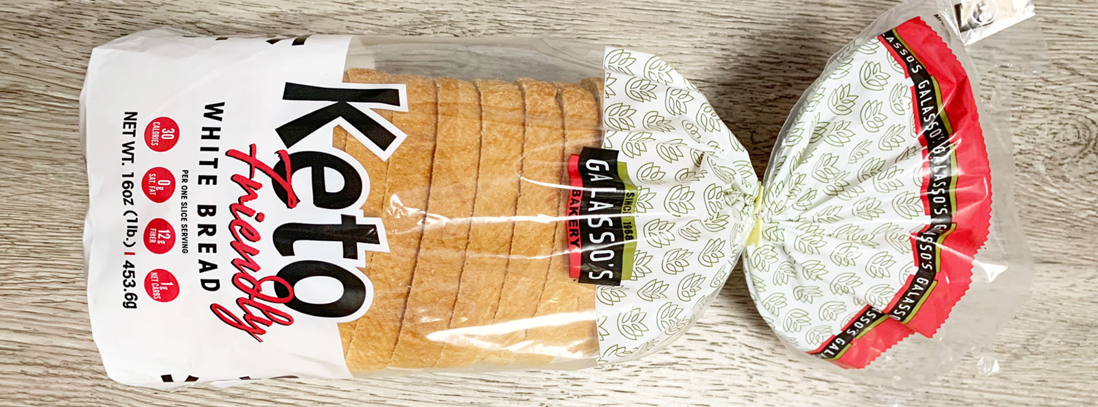
Galasso’s was entering a busy KETO consumer marketplace. Their prior wholesale packaging focused more on the their name and logo, as opposed to the product name. This is a very common retail packaging design misstep. Many smaller companies and especially start-ups make this mistake as well. The rule of thumb is, unless you are a well-known brand, keep your logo small and your product offering the star at the front of your package!
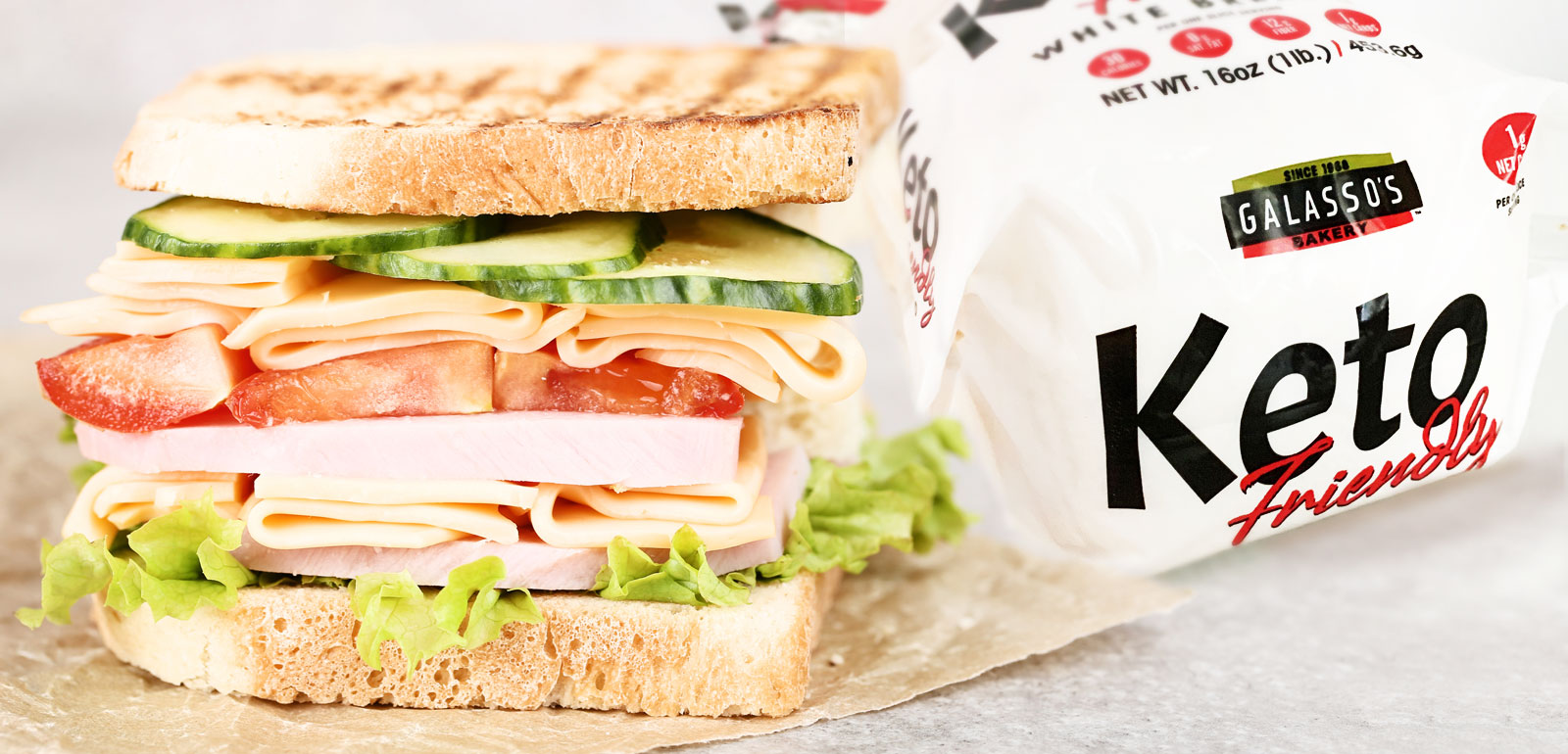
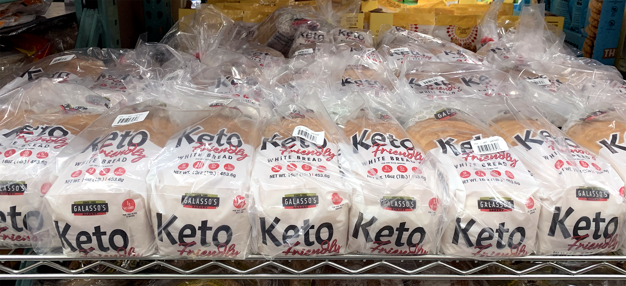
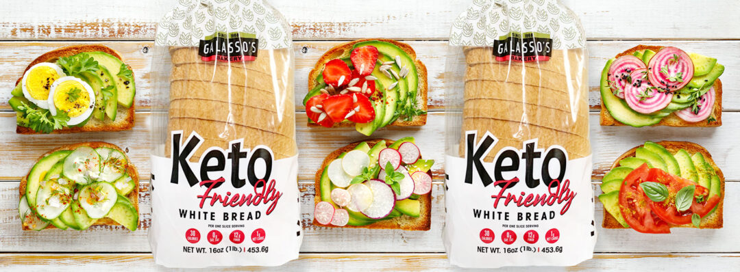
Even though Galasso’s is very well known in hospitality, their name was not yet known to the retail consumer. We recommended highlighting the name “KETO friendly” on the package, as that is what shoppers needed to notice first. We were also successful in identifying a fresh white color scheme. This also made the packaging stand out in a large discount warehouse like Costco.
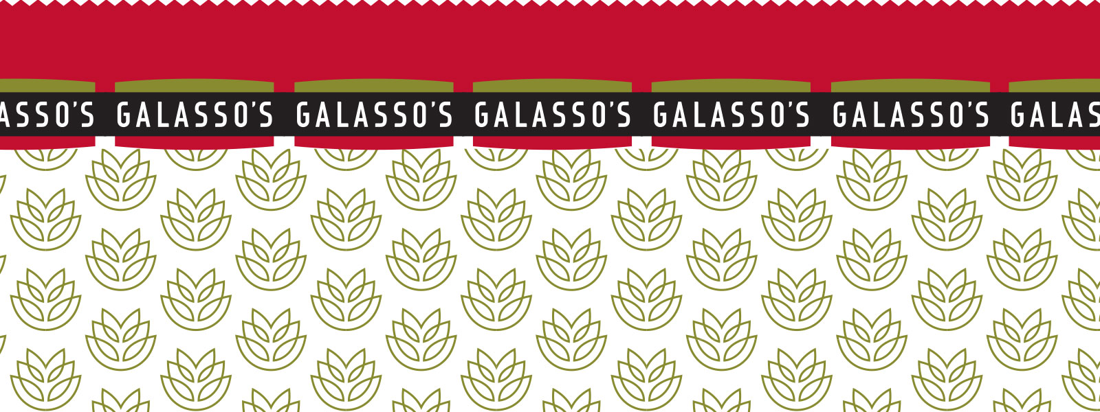
Additional design elements included callouts for the four most important food facts for KETO shoppers: Calories, Net Carbs, Protein and Fiber. We also adorned the top of the package with a repeating wheat illustration that gave the it a modern feel.
Galasso’s has been successful in getting the word out on social media. They have also been putting their product in the hands of KETO influencers on Instagram. Currently the bread is only sold in Southern California, but that could change based on its success.
Other food manufacturers that sell primarily to food service industries may benefit by following Galasso’s lead during this time of shutdowns and uncertainty.
Packaging for retail is a whole different ballgame though. Unlike delivering bulk products in plain wrappers to customers, packaging will be one of your most important sales tools for retail success!