Rock’N Fish Website Redesign: A Modern Refresh for a Manhattan Beach Classic
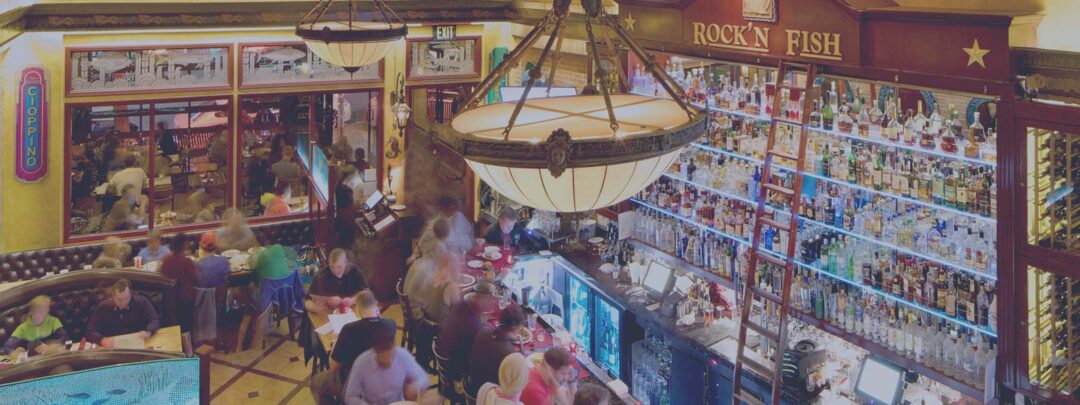
When you’ve spent more than two decades becoming a neighborhood institution, your website needs to evolve alongside your brand. Rock’N Fish’s previous website—originally designed by The Graphic Element years ago but built in HTML by an outside developer—had served the restaurant well at the time. But modern hospitality needs a refreshed brand identity as the limitations of older code made it clear that the site needed a rebuild. The restaurant team approached us with a clear goal: create a modern, guest-friendly website on a platform they could confidently maintain themselves.
The Challenge: A Trusted Legacy Website That Needed to Evolve
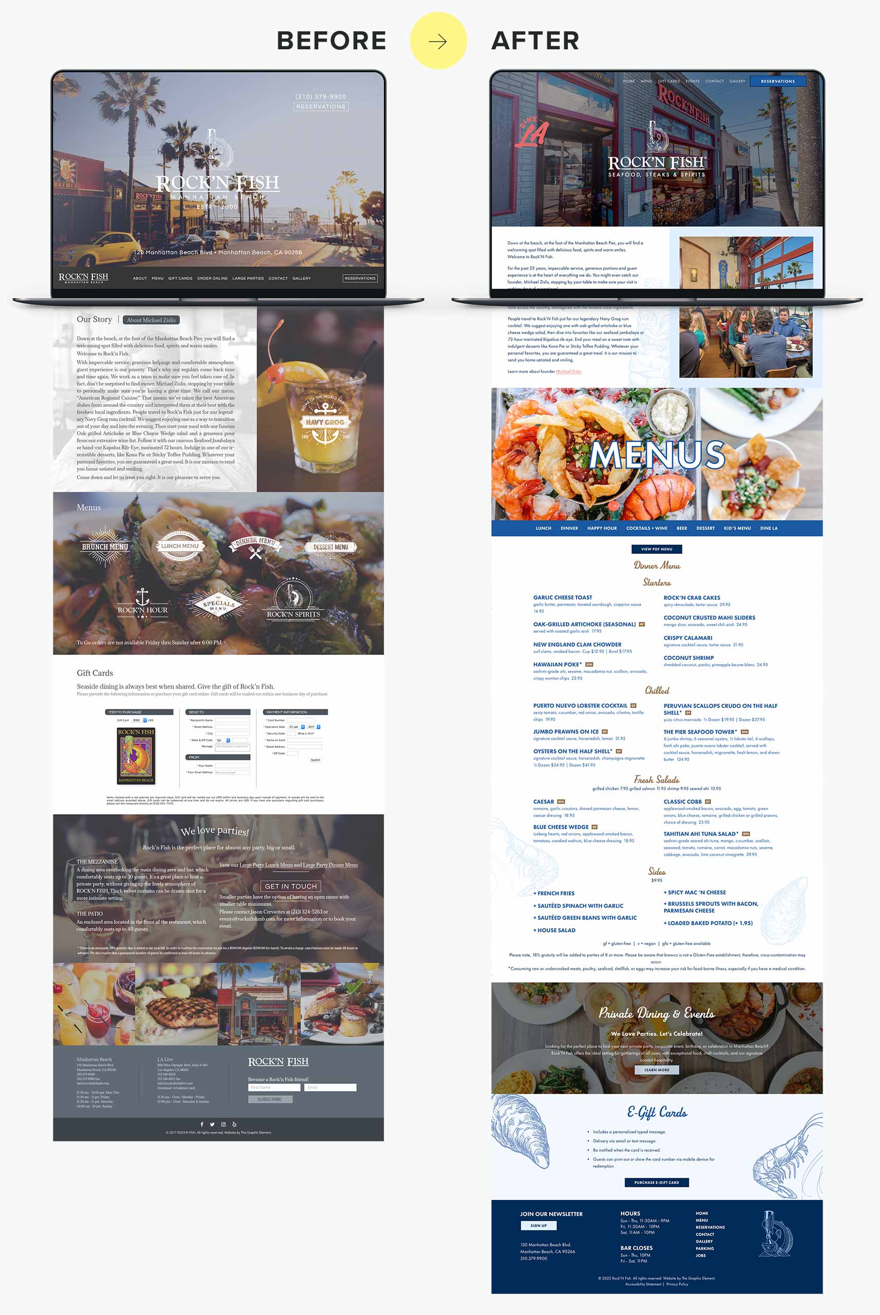
Rock’N Fish had recently updated their visual branding in-house: a new color palette, refined typography, updated graphics, and fresh visual direction. But their existing HTML website—built by a developer using TGE’s original design—no longer aligned with the brand or supported their workflow.
Back when the site was created, using HTML with a separately structured mobile version was perfectly standard for hospitality clients. But as the restaurant grew and guest expectations shifted, those “old standard” choices became bottlenecks.
The limitations reflected familiar hospitality pain points:
- An older HTML foundation with a separate mobile site
- Visuals that no longer matched their updated in-house branding
- A workflow that required a developer for every small update
- Navigation that didn’t fit modern UX expectations
- No CMS for quick menu and promotions updates
Even a beautifully designed website eventually outgrows its original structure. When the brand evolves, the website must evolve with it.
The redesign became an opportunity to create a seamless experience that honored the refreshed identity and empowered the internal team.
Our Approach: A Modern Squarespace Rebuild With Custom Enhancements
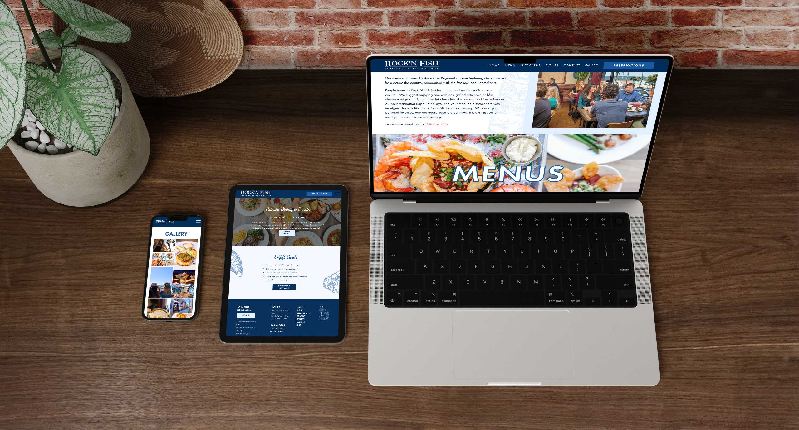
After reviewing the updated branding and understanding the restaurant team’s workflow needs, we rebuilt the entire website using Squarespace. This provided a flexible, intuitive content management system—perfect for a hospitality brand that updates menus, promotions, and photography often.
Our strategy centered around four core goals:
1. Fully Integrate and Honor Their Updated Brand Identity
We brought the refreshed palette, updated typography, and modern graphic elements into the digital space. The new homepage now reflects the warmth and energy of the Rock’N Fish dining experience, blending bold visuals with clean, contemporary layouts. This is clear in the newly styled hero sections and menu layouts showcased on the home page .
Brand consistency isn’t just visual—it’s a way to reassure guests they’re in the right place before they ever walk through the door.
The new design carries this consistency across every section.
2. Improve User Experience with Clean, Modern Navigation
The new website is intentionally structured as a single scrolling page, creating a simple, streamlined experience. But to support ease of use—and ensure guests can quickly find what they need—we broke out key sections into a clean navigation menu:
- Menus
- Events & Private Dining
- Parking
- Gallery
- Contact
- Reservations
This hybrid model gives guests the best of both worlds: the clarity of traditional navigation with the smoothness of a modern scrolling site. The Gallery section, for example, now operates as its own navigable space for easy browsing .
3. Add Custom Development That Elevates Squarespace Beyond a Template
Squarespace was the ideal choice for Rock’N Fish’s internal team, but we wanted to ensure the site still felt custom and elevated. So we added specific enhancements designed for hospitality needs:
Custom PDF Menu Buttons
Each menu—Lunch, Dinner, Happy Hour, Cocktails + Wine, Beer—features a custom-coded PDF button for easy browsing. These are cleaner, sharper, and more on-brand than standard Squarespace links.
Dedicated Events Page
The new Events & Private Dining page highlights the Mezzanine and Patio with detailed descriptions and curated photography. The clean, two-column layout brings clarity and polish .
Parking Page for Visitors
Manhattan Beach parking has its challenges. A dedicated Parking page now helps guests prepare before heading out.
Enhanced Footer Structure
The redesigned footer includes:
- Hours
- Location
- Quick links
- Reservations
- Menus
- A stylized brand-inspired illustration
- This structured layout significantly improves convenience for mobile visitors
Clients love the ease of Squarespace. They just don’t want their website to look like Squarespace.
These enhancements blend the accessibility of a CMS with the tailored feel of a custom-built site.
4. Empower the Restaurant Team With Full Editing Control
A top priority was eliminating barriers to updates. With the new Squarespace build, the Rock’N Fish team can now:
- Update menus seasonally
- Add new photography
- Adjust events information
- Update hours and holiday schedules
- Manage the Gallery page
- Post announcements and special offers
All without needing to call a developer or wait for turnaround time.
Results: A More Intuitive, Beautiful, and Flexible Digital Experience
Even without analytics, the improvements are immediately clear:
Better Guest Experience
- Quick access to menus, reservations, and events
- Helpful parking information
- Instant visual understanding of the restaurant’s atmosphere
- Smooth mobile and desktop performance
Stronger Brand Alignment
- Visual consistency with updated branding
- Photography takes a leading role
- Clearer storytelling of the Rock’N Fish dining experience
Streamlined Operations
- Menu updates in minutes
- Seasonal promotions easy to publish
- Internal team gains full autonomy
A Future-Ready Framework
The new site can easily support:
- Special events
- Holiday menus
- Seasonal photography
- Additional content or sections
- Growth in their brand identity
When the website finally matches the brand experience, everything feels more seamless—from the first Google search to the first Navy Grog.
Final Thoughts
Rock’N Fish is a staple of Manhattan Beach, with a loyal community and a rich, welcoming atmosphere. Their redesigned website finally reflects the energy, warmth, and polish of the in-person experience—modern, intuitive, guest-focused, and easy for their team to manage.
By rebuilding the site on Squarespace, fully integrating their updated branding, and adding custom enhancements to elevate the framework, we delivered a website ready for Rock’N Fish’s next chapter.
If your restaurant’s website feels outdated, hard to update, or disconnected from your brand, we’d love to help you build a digital experience that supports your team and delights your guests.