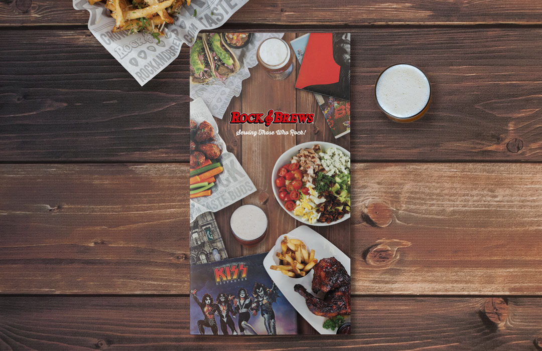
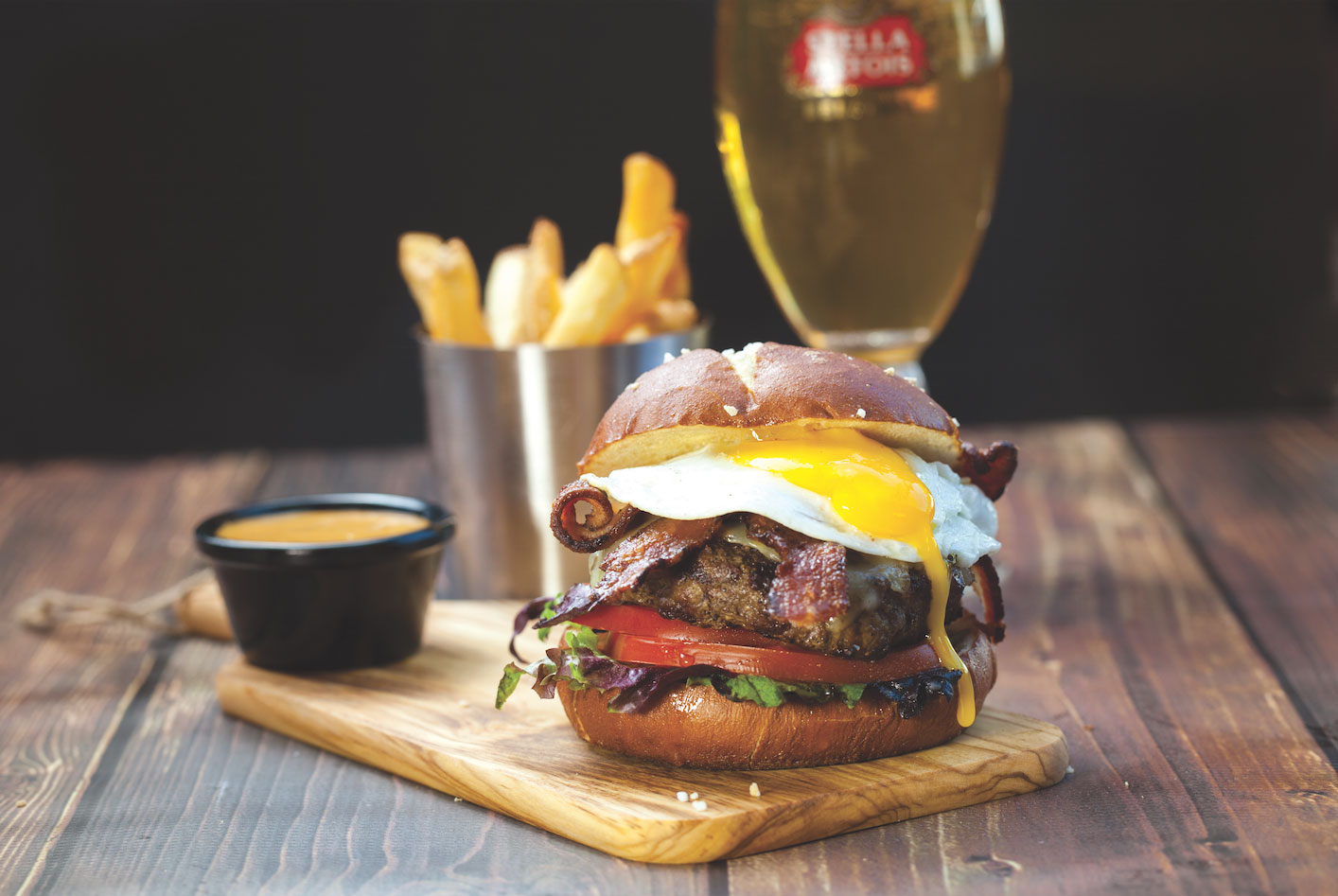
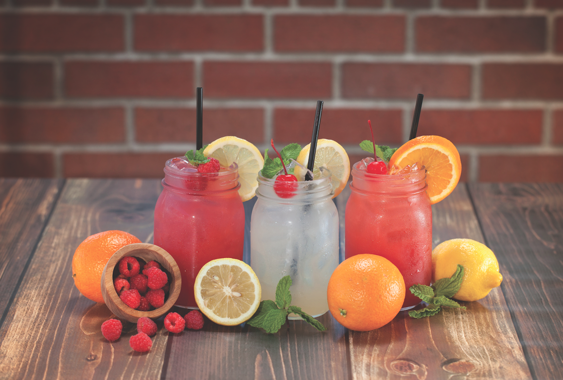
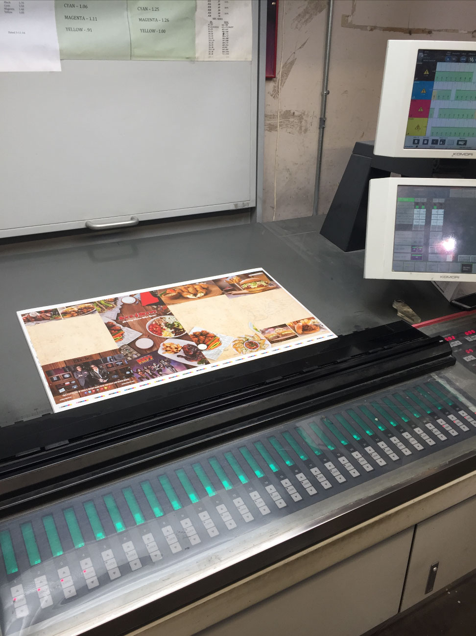
A franchise wide menu re-design was a challenging and tedious process for everyone involved. We started with a rough design concept and moved quickly into several days of art directing food and drink photography. Once all the photos were approved we worked with the Director of Operations to layout each location’s specific menu.
We chose synthetic paper for their new menu launch mostly for its durable and waterproof qualities, but we also learned that it’s environmentally friendly (no trees, recyclable). This substrate has such a high quality feel, that you cannot easily tell it apart from “real” paper. Other unique characteristics that distinguish synthetics from pulp-based papers are strength and durability: They are tear-, water-, chemical- and grease-resistant, as well as UV-stable. This makes them a perfect option for the rugged use in restaurants
This particular brand of synthetic paper required UV printing, otherwise the ink would not adhere. UV printing is different from conventional printing in that the UV inks dry through a photomechanical process, thus eliminating emission of volatile organic substances into the air.
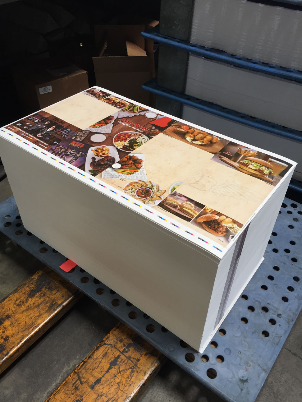
Since we needed to provide menus to numerous locations, we designed it around a two-part print run. We first printed a color version to serve as the master which included all photos and color logos; then a black plate was run separately as a second process. Doing so allowed each restaurant to feature customized content unique to their location.
The results so far have been amazing. Rock & Brews reports increased sales of most, if not all, items featured in the menu. We are proud to be involved with such an exciting and growing company.
