Rebuilding a Brand from the Inside Out: How The Graphic Element Unified the Shawanoe Steak & Spirits Identity
Shawanoe Steak & Spirits presented a challenge many brands face: part of the identity was already built, part of it wasn’t, and the pieces weren’t working together. The logo for their signage was locked in, their interior was refined and contemporary, and the gap between the two was what we needed to address. The restaurant had the ingredients for a strong brand—a clear culinary vision, a modern dining space, and an established location—but no cohesive system to unite them. Our task was to take what existed, refine it thoughtfully, and build a complete, scalable identity that finally aligned the visual brand with the elevated experience Shawanoe was designed to deliver.
Shawanoe Steak & Spirits is a signature restaurant located inside the Indigo Sky Casino in Wyandotte, OK. It offers USDA Prime steaks and chef-driven specialties in a modern environment. Their culinary vision was already well-articulated in their genuine warmth, handcrafted cocktails, bold flavors, and first-class service. But the visual identity didn’t yet reflect that mission.
This disconnect is common across many industries—hospitality, entertainment, retail, corporate environments, casinos, and beyond. Physical spaces evolve. Logos are locked in. Deadlines move faster than design systems can keep up. And suddenly, leaders look around and realize their brand isn’t telling the same story their business is.
That was the moment we were called in.
The Challenge: Aligning What Existed With What the Brand Needed to Become
Stepping into a project mid-stream is a different kind of design problem. It requires strategy, restraint, and the ability to elevate existing assets rather than replace them.
Shawanoe brought us three core challenges:
1. A Pre-Existing Logo Already Installed in Signage
The initial logotype direction—shaped by rough wood-type influences—was complete and installed. Replacing it wasn’t feasible. But it didn’t fit the new environment or the tone of a modern upscale steakhouse.
2. A Contemporary Interior the Logo Didn’t Match
The restaurant’s interior was set and featured warm upscale features including layered lighting, sophisticated neutrals, and a modern layout. It felt premium. It felt intentional. And it deserved a brand system that belonged in the same visual world.
3. A Lack of Cohesive Brand Guidelines
Beyond signage, the brand had no other assets—no guidelines for typography, color, patterns, menu hierarchy, or guest-facing items.
These aren’t just hospitality challenges. They’re identity challenges. And they’re problems we love to solve!
Our Approach: Refine, Expand, and Systematize
Our solution wasn’t to start over—it was to respect what existed, refine it, and build a unified ecosystem around it.
This is where our strategic identity work shines.
1. Logo Refinements That Honor the Original While Elevating It
We kept Shawanoe’s established logotype but updated its structure to feel more polished and aligned with the restaurant’s environment.
We created a complete logo family, including:
- Primary horizontal logo
- Secondary logo that included an icon
- Icon-only mark (a flexible “S” mark that could be cropped or enlarged for visual impact)
These additions gave Shawanoe the branding options it had been missing.
2. A Warm, Modern Color Palette Inspired by the Interior
To harmonize the physical and visual experience, we built a palette rooted in the restaurant’s atmosphere:
- Cream
- Chocolate
- Tan
- Pumpkin
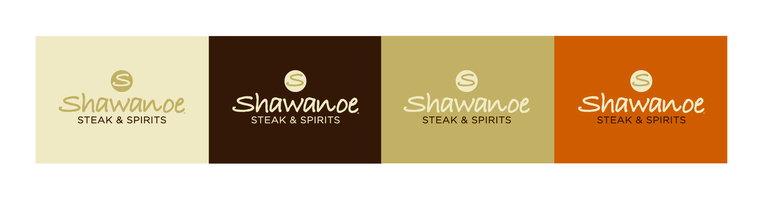
These tones echo the restaurant’s interior materials and lighting, helping the brand feel integrated across signage, menus, and marketing collateral. We also added clear usage rules for contrast and logo application.
3. Typography That Matches the Brand’s Personality
Shawanoe’s vision emphasizes modern sophistication and genuine warmth — a balance mirrored in their messaging. We used typography to express that:
- Gotham Narrow Family for a clean modern structure
- Allura Script for aspirational copy lines and the brand’s signature tagline
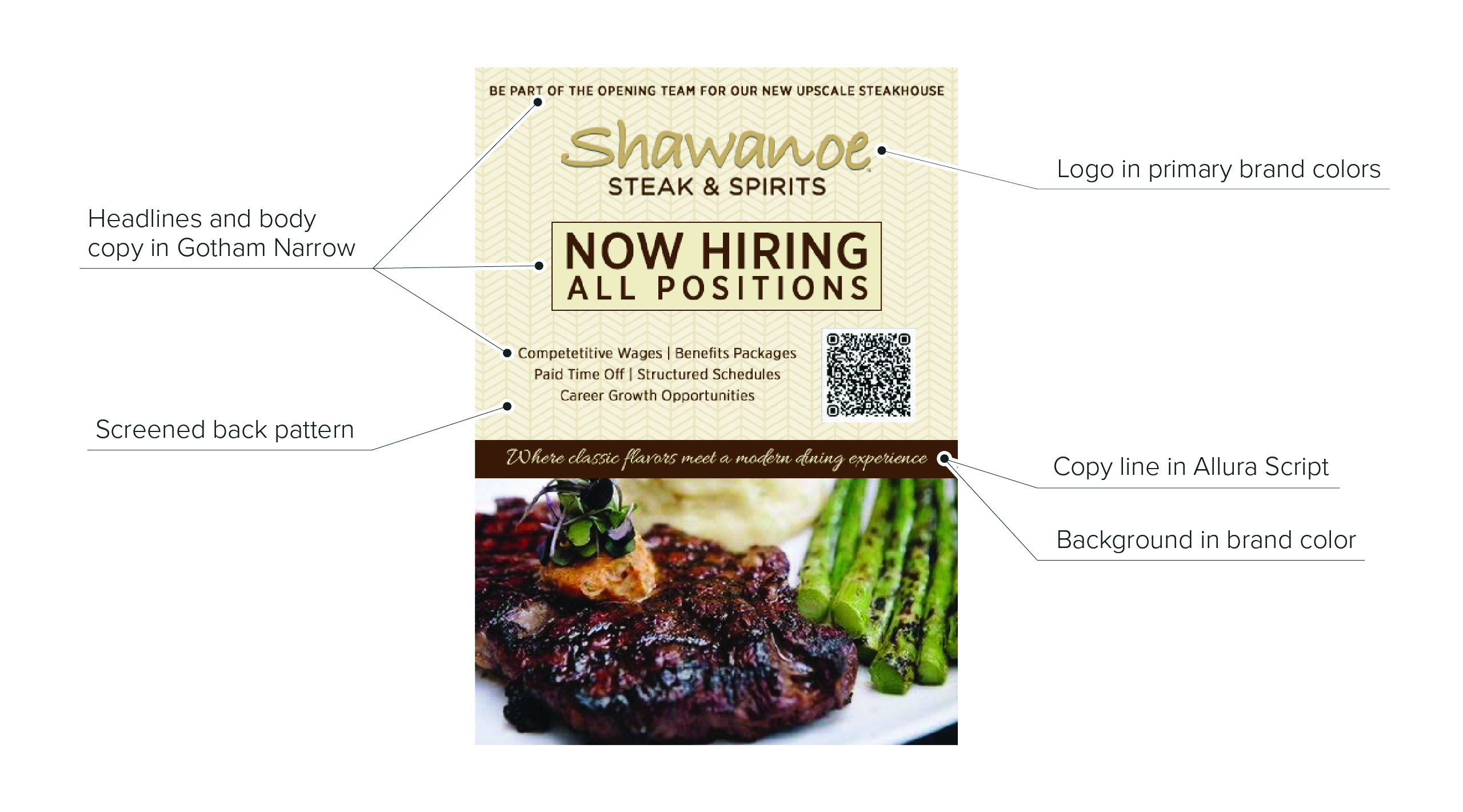
The combination supports both elegance and readability across all applications.
4. Custom Patterns That Add Depth and Identity
Patterns became a signature part of the system.
We developed four custom patterns, each designed to be used as:
- Background textures
- Menu accents
- Borders or separators
- Branded collateral elements
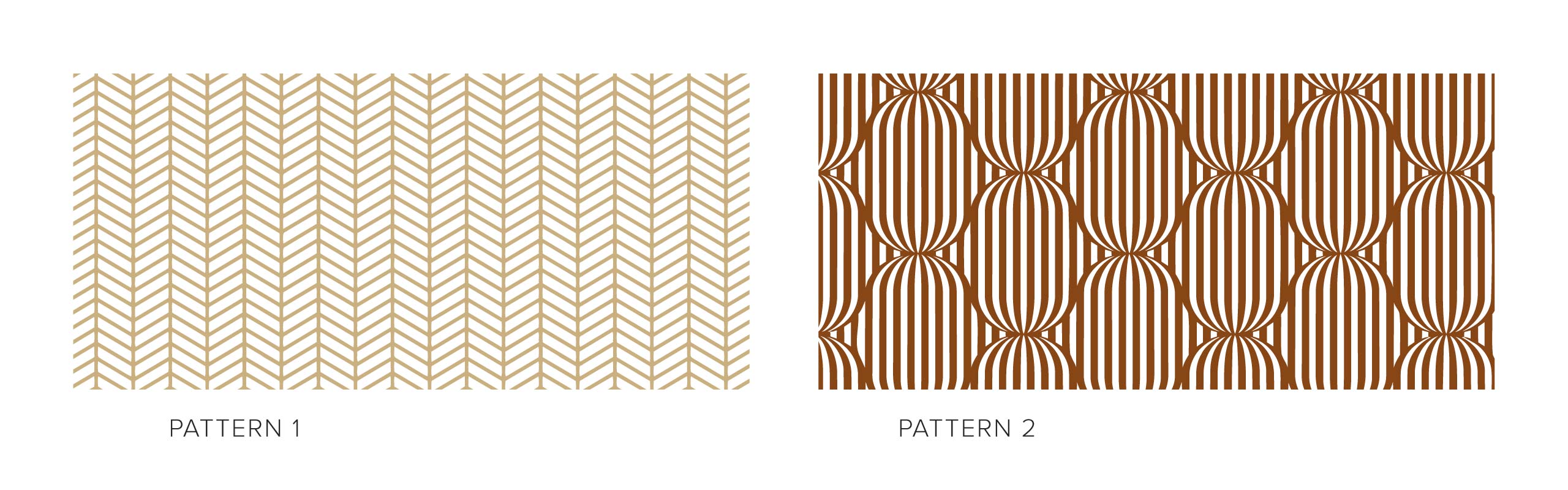
These patterns are inspired by the interior elements within the restaurant itself, reinforcing the connection between space and brand.
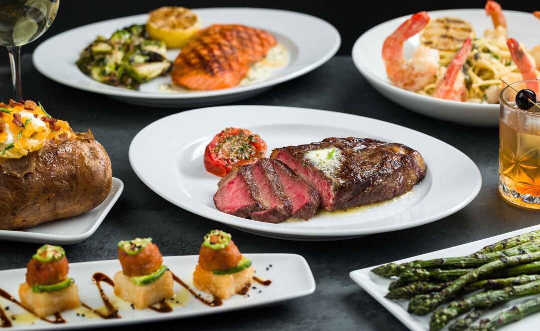
5. A Fully Structured Menu System
Menus are one of the most important brand touchpoints in any dining experience. We created:
- A text hierarchy
- Clear section dividers
- Pattern-tinted backgrounds
- Modular, expandable layouts
- Systems for specials, wine lists, and events
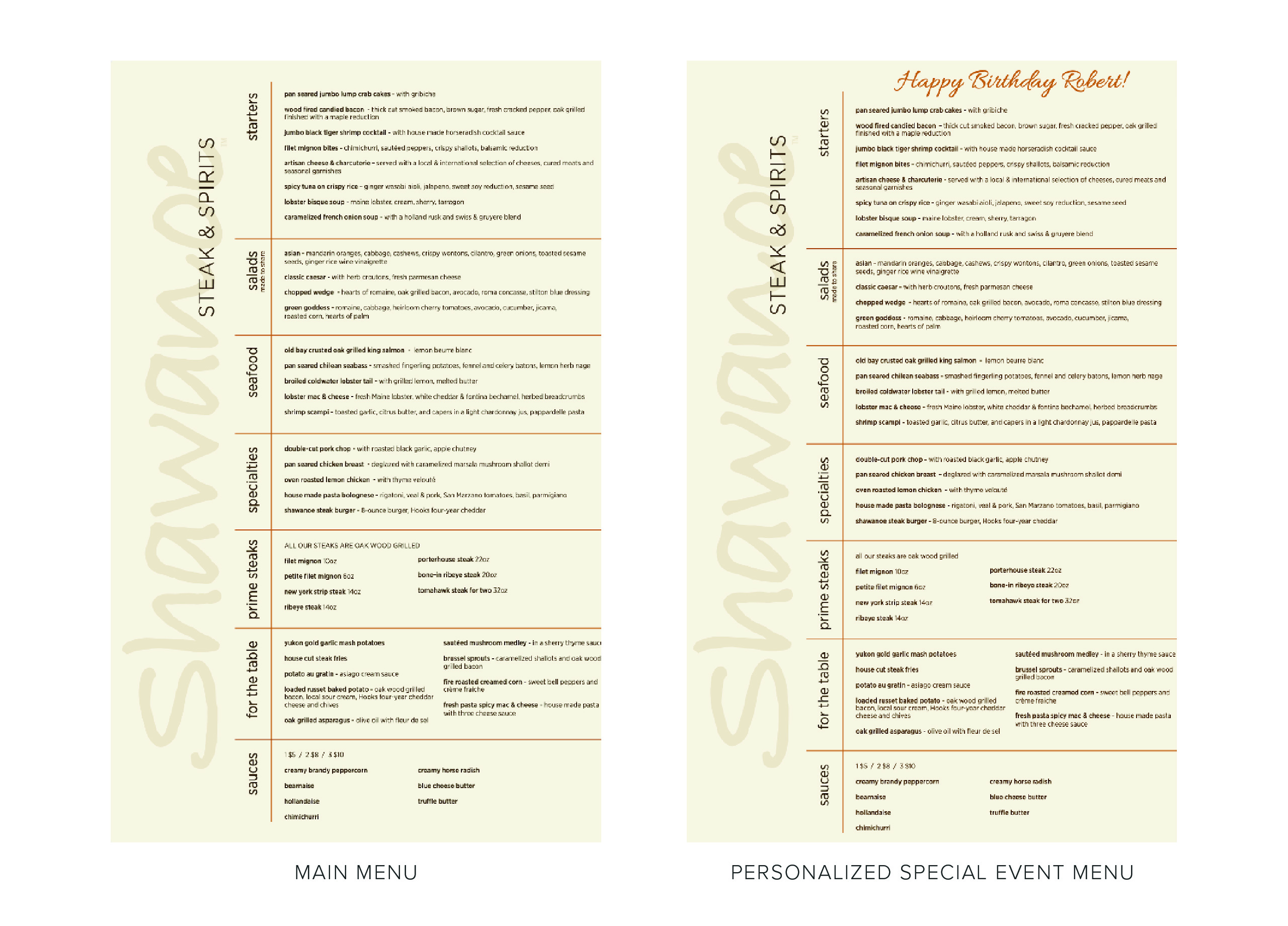
The menu is now both functional and aligned with the premium dining experience Shawanoe promises.
6. Branded Restaurant Items That Reinforce the Identity
To extend the brand into physical guest touchpoints, we developed:
- Custom coasters
- Layouts for promotional items
- Applications using the icon-only marks and patterns
Small details that can be carried through to multiple applications.
The Outcome: A Cohesive Brand Built From Real-World Constraints
By the end of the project, Shawanoe didn’t just have “brand guidelines.” They had an ecosystem—one that:
- Unifies the guest experience
- Elevates the visual identity
- Matches the sophistication of the dining space
- Supports future marketing
- Gives staff and partners a clear roadmap for consistency
Most importantly, the final brand reflects the restaurant’s core promise: a refined, modern dining experience rooted in craft and warmth.
This is the kind of work that applies far beyond hospitality. Any brand—casinos, corporate environments, entertainment venues, retail spaces—can find themselves with mismatched assets, evolving spaces, and an identity that hasn’t kept up.
Shawanoe shows what’s possible when strategy, design, and real-world constraints work together.
You don’t need to start from scratch to build a brand that works.
You just need a system designed to bring everything into alignment.
We were proud to help Shawanoe Steak & Spirits find theirs.